Serving you better with a new look
Formline reveals their revitalized brand identity
Inspired by our purpose of unleashing the
potential of both people + property, we set out to build a visual identity that better reflects who we are.
Grab a coffee & read on to discover what we changed and why.
So… why the new look?
It's really quite simple.
A few months ago, we decided to spend some time working 'on' the business, strengthening systems and strategies to enable better client experience.
During this time, we went back through past projects and analyzed what made them truly successful. We took the recurring success patterns and brainstormed how we could make these more visible. We talked to our partners about what it was that made them keep coming back to Formline.
And then with these findings we examined our current brand identity and saw that certain aspects of it were both restrictive, and did not align with the brand we had become.
We needed something to represent how our partners described us - an experienced, reliable, and trusted solution provider offering a seamless experience through our proven process.
Hence, we set to work building the crisp, new brand face that you see today.
Got it.
And what exactly has changed?
Well, a good place to start is talking about what has not changed.
Our passion for unleashing potential, our values, our capabilities in delivering end to end design & construct solutions, our trusted group of professionals, our unrelenting drive, our expertise - that’s all still there and only gets stronger every day.
We just wanted to find a way of making all these valuable characteristics visible through a first class brand experience.
Read on to discover our four elements of change.
A refinement. A logo. A style.
A website. A new Formline.
The refinement.
As we analyzed our past project successes and talked about these with our clients, it became increasingly clear that it was not just the end result that determined success, but how Formline delivered, our unique process that enabled the delivery.
We found that so often, assumptions are made about how much the client knows about the design & build process, and so we set to work refining our process into something simple and tangible. To not only give our clients visibility & clarity as to the future project journey, but also the certainty to move forward, faster.
Along with this, our ‘project consultancy’ service was also born - this is something we have always done, but by separating it out from our main D&C service and giving it a name, it means in those initial project stages, the steps are simpler and we can hit goals faster with our clients.
The logo.
-
1995
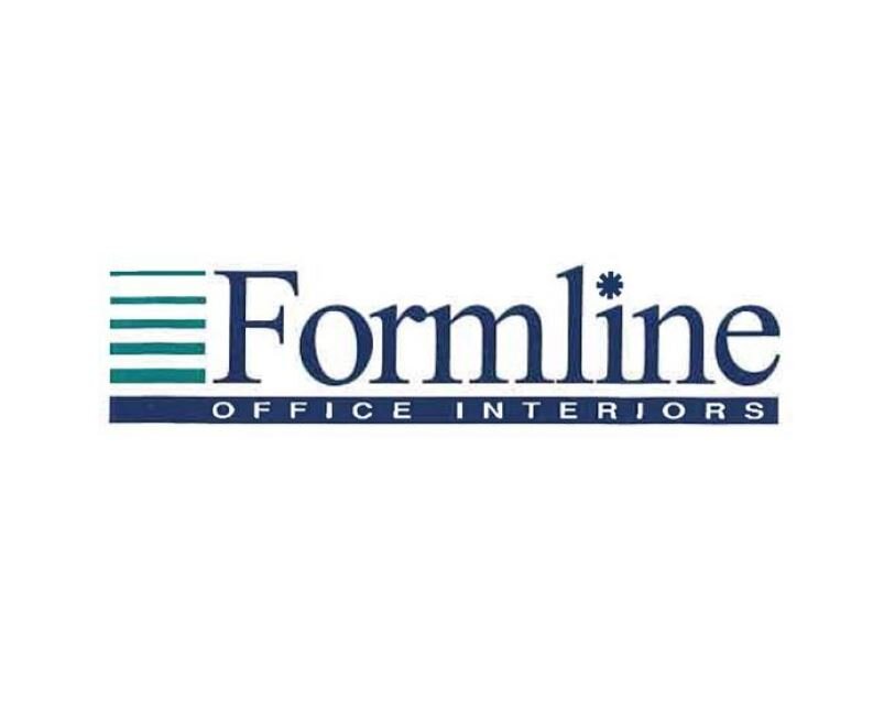
The logo symbol comprises of stacked horizontal line, with a thick horizonal bar and san serif font to highlight ‘office interiors’. The horizonal lines were created to represent the key areas of business at the time.
Read more about how Formline started here.
-

2012
Maintaining the layout, we modernised the logo and the four stacked horizonal lines were created to represent layers in construction & the four key areas of business - fitout, design, refurbishment & construction.
-
2021
Whilst the core elements of the process have not changed, our visual presence within the industry continues to grow.
Built on the foundations of transparency & trust, there are no filled in components in our logo - instead clear, architectural lines make the shape of an F and encompass the full concept of our end to end D&C offering - from the the lines of a concept sketch to CAD drawings to sturdy scaffolding & cranes used in the build phase.
The minimal & simplistic feel leaves the viewer feeling fresh & uncluttered, reflecting our unique process designed for "making it easy for clients".
The style.
Transparent, trustworthy, quality, reliable, experienced, professional, proven, clever.
Contemporary and modern - showcasing exceptional urban environments.
Detailed oriented, purposeful, passionate partners. Seamless collaboration, inspiring impactful results.
This is the language which is reflected by our deliberate selections for every brand element.
The darker colours invoke a sense of trust, reliability, confidence and proven methods, complemented by the revitalizing teal tones which convey a calm atmosphere, intertwined with sophisticated simplicity.


