Eighties Workspace Reinvented
Fonts, facades and branding basics
Rapid Plas chose to engage Formline Group to re-invent their existing office space in order to create an open plan layout. The building and environment were utilised to improve collaboration and communication between both staff and customers.
Formline Group’s in-house interior designer Belinda Gillogly, explains how she subtly incorporated Rapid Plas’ branding into their new office space.
“The majority of clientele are farmers, so the brief was to create an informal, collaborative space integrated with the reception. We chose to incorporate an angled column, creating a coffee bar like area, for sales representatives and clients to gather around to discuss product brochures etc. The layout was designed to make clients feel more comfortable in the overall space.
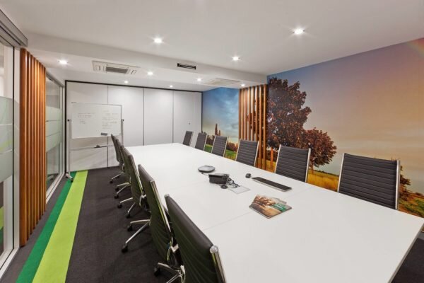
“Rapid Plas use angles in their branding. We decided to carry this through to develop the reception counter. We integrated ideas of the company’s workings into the design, in the way of circles to reinforce tanks and angles to reference the italic font in their logo. These subtle hints develop branding through design without being too obvious. Ripples in texture across the façade of the reception desk were added, to link the company’s product theme ‘water and tanks’ to the overall design. Obviously green was the feature colour used throughout the fitout, which we paired with neutrals like grey and white to keep it fresh. We also introduced other punches of colour in the wall murals, which adds interest and boosts the atmosphere.
“We’ve received great feedback from the team at Rapid Plas and they are currently loving their new working environment.”
We love designing bespoke workspace solutions! Get in touch with us to explore what we could do for your business.


